
You know that feeling when you walk into someone’s kitchen and it just stops you in your tracks? Not because it’s massive or packed with fancy gadgets, but because the color is so good you forget you came in for a glass of water. Green kitchens do that. Every single time.
I’ve spent a ridiculous amount of time looking at green kitchens, painting swatches on walls, and convincing friends to take the leap. And what I can tell you is this: green is the most forgiving, most flexible, most genuinely beautiful color you can bring into a kitchen. It works with old houses. It works with new builds. It works with your grandmother’s china and your brand new espresso machine.
So if you’re sitting there staring at your boring kitchen wondering where to start, you’re in the right place. Here are 21 green kitchen ideas for 2026 that actually look as good in real life as they do on your saved Pinterest board.
1. Sage Green Cabinets — The Classic That Never Gets Old
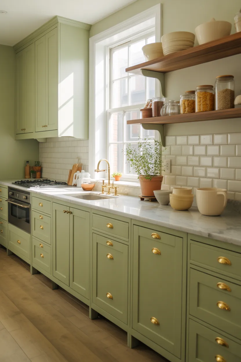
Sage green cabinets are the answer to almost every kitchen question. Too dark? Sage. Too cold? Sage. Too boring? Sage. It’s the color that somehow manages to be neutral and interesting at the same time, which is genuinely hard to pull off.
If you ask me, sage green is the “little black dress” of kitchen design. It works in a tiny cottage kitchen, a modern open-plan apartment, a traditional family home, basically everywhere. The color is soft enough to keep the space feeling light and airy but it has enough personality that your kitchen actually looks like you made a decision, which is more than beige can say.
Also Read: 22 Kitchen Inspiration Ideas 2026 That Feel Modern and Warm
Pair sage cabinets with warm brass hardware and you’ve got a kitchen that looks like it belongs in an interiors magazine. Add open shelving in natural wood above the counter, maybe a simple white subway tile backsplash, and you’re honestly done. Some people spend months overthinking this and the answer was sage green the whole time.
What works with sage green:
- Cream or white walls to keep things light and airy
- Butcher block or walnut countertops for warmth
- Terracotta tiles as a backsplash for an earthy, sun-soaked feel
- Black or brass fixtures depending on whether you want cool or warm tones
- Natural linen curtains if your kitchen has a window
The great thing about sage is that it ages well too. It doesn’t feel trendy in a “this will look dated in three years” way. People painted their kitchens sage in the 1980s and those kitchens still look charming today. That’s the kind of staying power you want when you’re making a big decision.
2. Deep Forest Green Island — One Bold Move
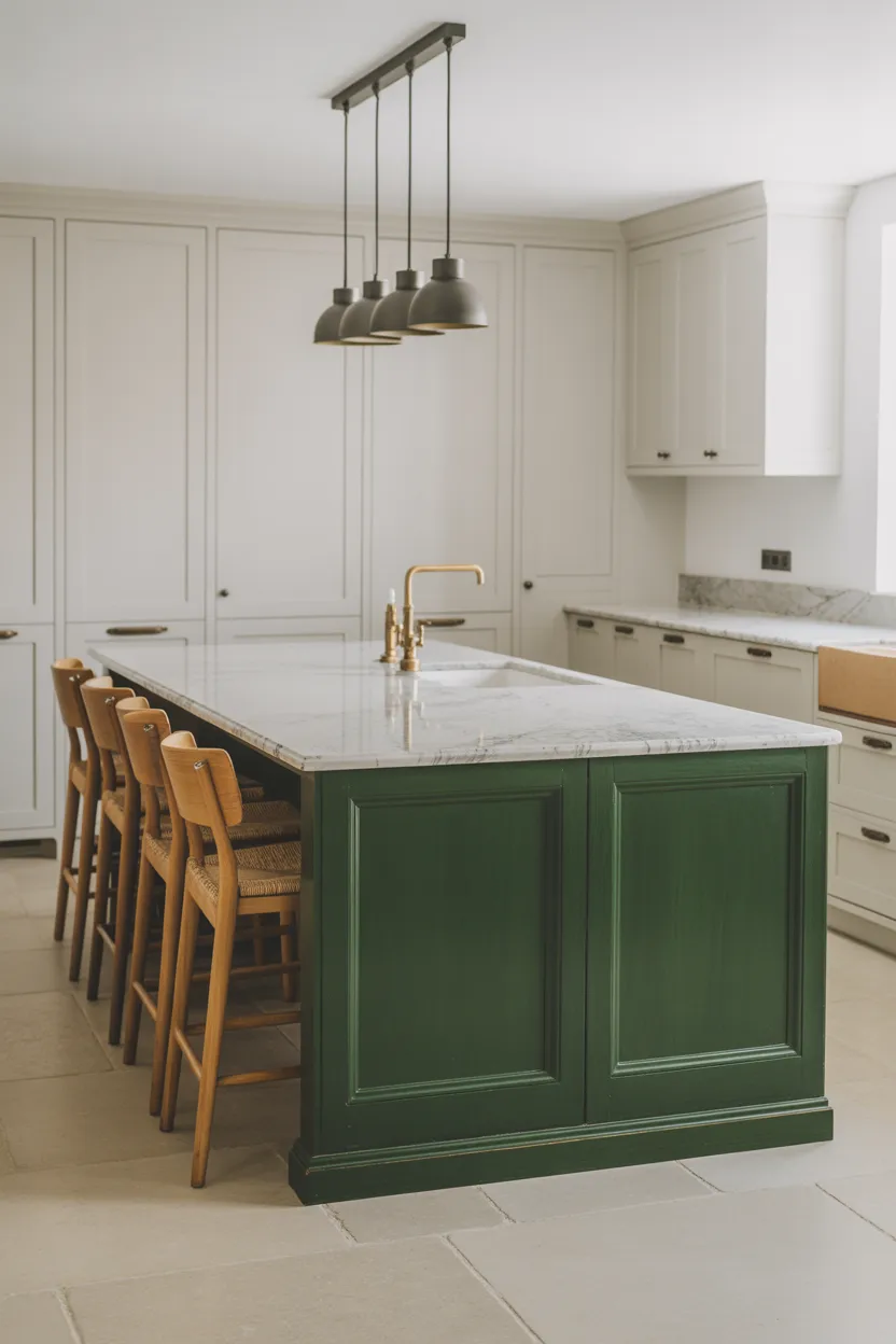
Here’s the thing about full kitchen renovations: they’re expensive, stressful, and your family will eat cereal for three weeks while you wait for the countertop to arrive. If you’re not ready for all of that, just paint the island.
A deep forest green kitchen island against white or light grey perimeter cabinets is genuinely stunning and you can do it over a weekend. It gives you that dramatic contrast without committing your entire kitchen to one color, which is a very sensible way to test the waters before you go all in.
Forest green and white marble is one of those combinations that almost never fails. The cool, creamy tones in the marble balance out the depth of the green, and the whole thing reads as intentional and expensive, even when the marble is actually quartz and the island was painted with a roller on a Saturday afternoon. Nobody needs to know.
If you really want to push this further, add some brass cabinet pulls to the island and keep the perimeter cabinets with simple chrome or brushed nickel. The contrast between the metallic tones adds another layer of visual interest and makes the island look like it was designed that way on purpose, not just painted green because you saw it on Instagram and got inspired at 11pm.
3. Olive Green Lower Cabinets with White Uppers
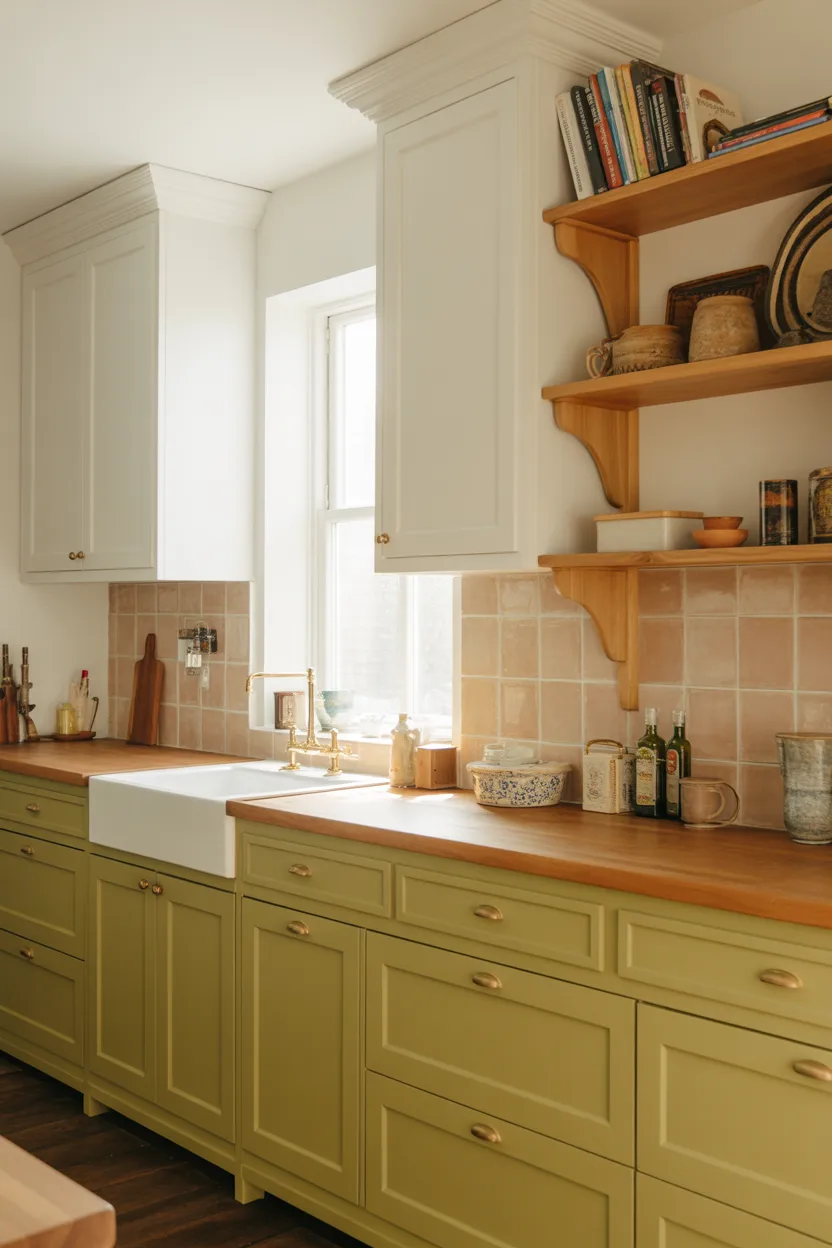
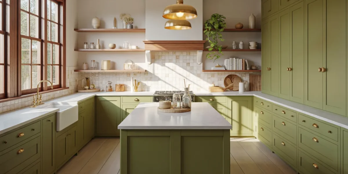
Two-tone kitchen cabinets are one of the best design decisions you can make, and olive green on the bottom with white or cream on top is one of the smartest combinations available right now. It grounds the kitchen without making it feel heavy, which is something darker colors can sometimes do if you’re not careful.
The eye reads the lighter upper cabinets first, so the room still feels open and bright even with a strong color on the lower half. It’s a bit like wearing a dark outfit with a light top. The overall impression is still put-together and fresh, even though you’ve got some weight at the bottom.
IMO, olive green is one of the most underrated shades in the green family. It leans earthy and warm rather than cool or minty, which makes it perfect for kitchens that get decent natural light throughout the day. If your kitchen faces east or south, olive absolutely glows in the morning sun in a way that sage and forest green simply don’t. It takes on this warm, golden quality that makes the whole room feel genuinely inviting.
Pair the lower olive cabinets with a simple cream countertop, brass or gold hardware, and some open wood shelving on the upper section instead of full upper cabinets. That combination is incredibly popular right now and for good reason. It feels collected and considered without looking like you spent six months planning it, even if you did.
4. Emerald Green Backsplash Tiles
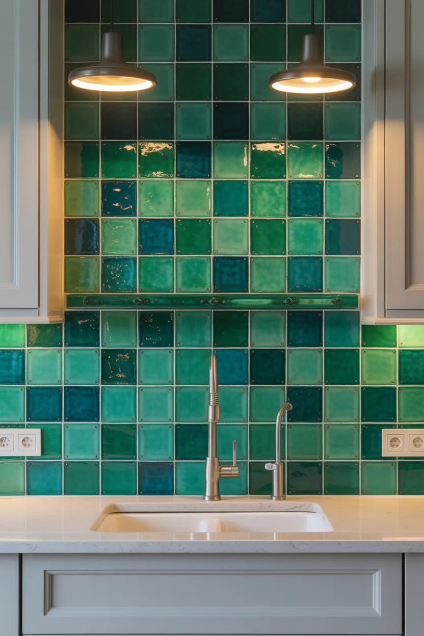
Sometimes you don’t need to touch the cabinets at all. An emerald green tile backsplash can completely transform a boring kitchen into something special without touching a single cabinet door. It’s honestly one of the highest-impact, lowest-commitment moves in kitchen design.
Zellige tiles in emerald are incredibly popular right now and I completely understand why. They have that slightly irregular, handmade texture that catches light differently throughout the day, so the backsplash almost seems to shift in color depending on the time of day and what light is hitting it. Morning light makes them glow. Evening light makes them almost jewel-like. It’s hard not to love that.
Keep everything else simple if you go this route. White or off-white cabinets, clean simple hardware, maybe a natural stone or plain quartz countertop in a neutral tone. The backsplash is the star here and it knows it. Give it the stage and step back. You don’t need to compete with emerald green tiles. Nobody wins that fight.
One thing worth mentioning: square or rectangular zellige tiles laid in a simple grid look better here than any complicated pattern. The beauty of these tiles comes from the texture and color variation of the glaze, not from a complicated layout. Keep the installation classic and let the material do the work.
5. Matte Green Appliances
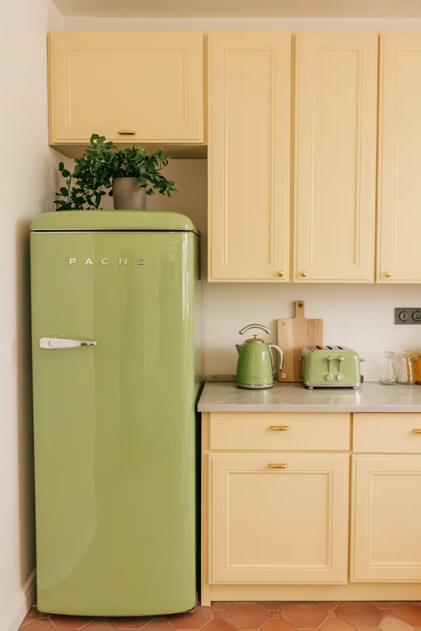
Can we have a quick word about the fact that we all collectively agreed kitchen appliances had to be stainless steel or black for about twenty years? Who made that rule? Because matte green appliances are a thing now and honestly, it’s about time.
Matte green fridges, ranges, and small appliances like kettles, toasters, and stand mixers are showing up everywhere, and they look incredibly good in the right kitchen. There’s something almost playful about walking into a kitchen and seeing a sage green fridge standing next to cream-colored cabinets. It’s unexpected. It works.
Also Read: 20 Kitchen Cabinets Ideas 2026 That Look Stylish and Smart
Smeg and Big Chill both make retro-style appliances in green tones that would genuinely stop you in your tracks if you walked past them in a showroom. Yes, they come with a price tag. Yes, you might hesitate when you see the number. But if you’re already spending money on a kitchen renovation and you’re looking for that one thing that makes the whole room feel special, a statement green appliance might be exactly that thing.
If a full-size fridge is too much commitment, start small. A sage green kettle and toaster set on a white countertop costs a fraction of the price and brings that pop of color in exactly the right place. It’s a low-risk way to try living with green before you repaint an entire wall of cabinets.
6. Green Open Shelving
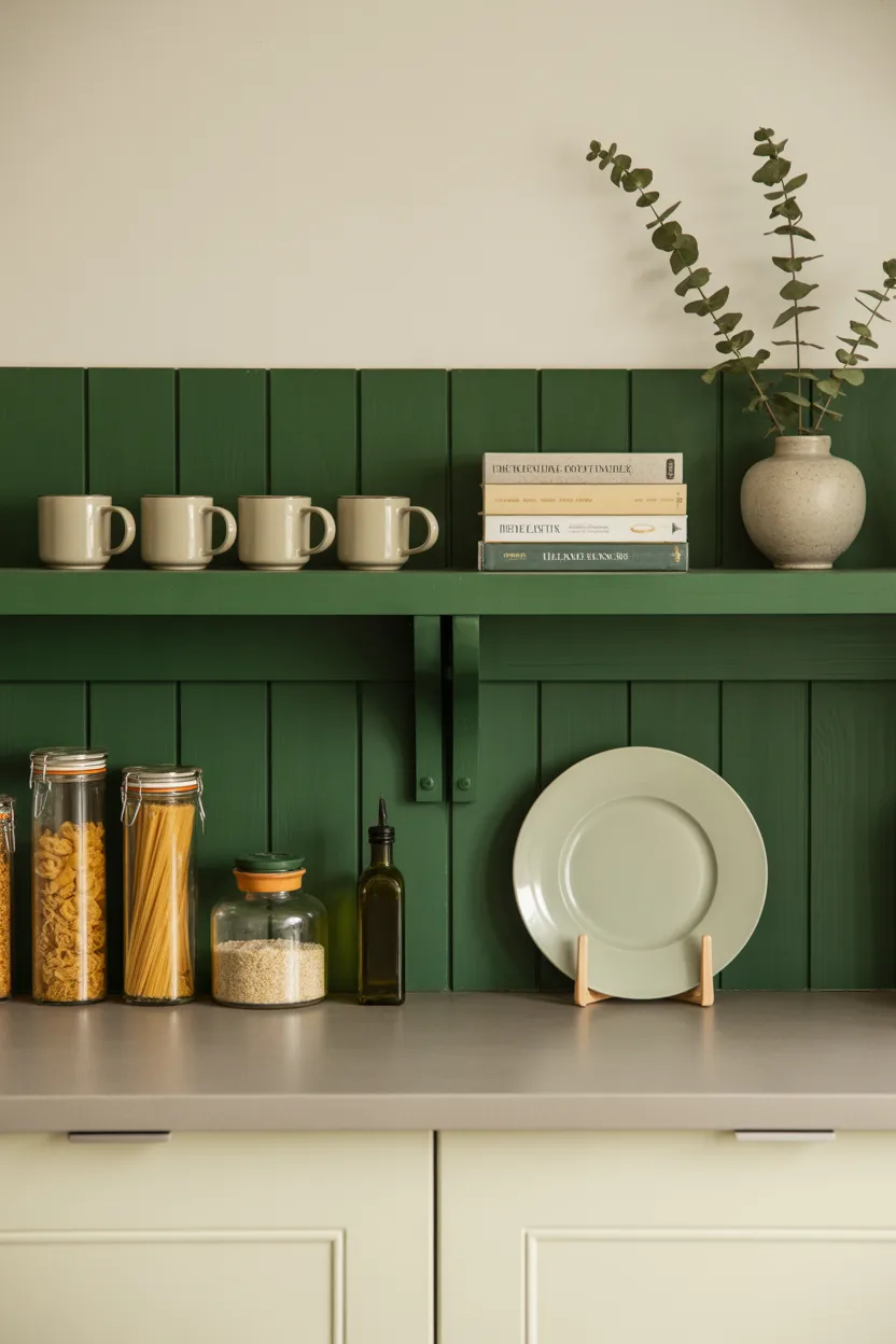
Open shelving has a reputation problem. People install it, fill it with everything they own, and then wonder why their kitchen looks chaotic and stressful. The answer is usually not the shelving itself. It’s what’s on the shelving.
Paint those shelves in a deep green though, hunter green or bottle green, and something interesting happens. Even a moderately organized shelf starts looking curated. The color creates a strong visual backdrop that makes everything in front of it look more intentional. Your everyday coffee mugs suddenly look like you chose them carefully. Your mismatched spice jars look almost charming. It’s a bit of visual sleight of hand and it works really well.
The key to making green open shelving look good rather than overwhelming is restraint. Keep about three-quarters of the shelf space dedicated to things that look good: ceramics, glassware, a stack of cookbooks with nice spines, a small plant or two. Use the remaining space for the genuinely everyday stuff. That balance is what separates a styled shelf from a crowded one.
If you have existing white or wood shelves, painting them green is genuinely one of the cheapest and most effective kitchen updates you can do. A tin of good paint, a small roller, one afternoon. The difference is remarkable enough that people will ask if you renovated your whole kitchen. 🙂
7. Two-Toned Green — Sage and Forest Together
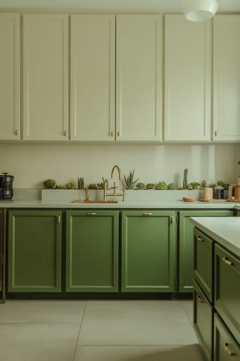
Who decided you had to pick just one shade of green? Nobody, that’s who. Layering two shades of green, a lighter one like sage or mint with a darker one like forest or bottle green, creates a tonal look that’s sophisticated without being cold or intimidating.
Think sage upper cabinets with deep green lowers, or a sage green island with forest green pantry doors on the perimeter. The variation in depth adds visual interest that you just don’t get when everything is the same shade, while keeping the palette cohesive because both tones are still fundamentally green.
This approach works best when you vary the finish as well as the color. Matte on one set of cabinets, slightly satin on the other, gives you depth that you can feel even when you can’t quite explain what’s different. The light hits them differently and the eye picks up on that variation even if the brain doesn’t consciously register why the room feels so layered and interesting.
The one thing to watch out for is making sure your two greens actually work together. Bring paint chips home and look at them in your kitchen’s specific light before committing. Two greens that look fine in the hardware store can look wrong together in a different light. Natural daylight, artificial light in the evening, all of it matters. Take your time with this one.
8:Green Kitchen with Exposed Brick
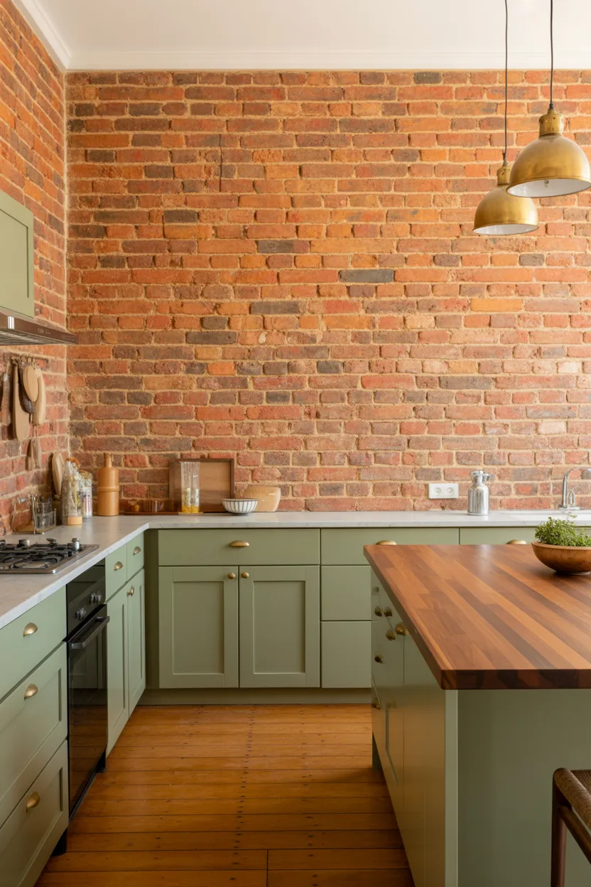
Green and exposed brick is one of those combinations that feels like it shouldn’t work on paper and then absolutely does in person. The red-orange tones in brick sit opposite green on the color wheel, which means they’re genuinely complementary. They balance each other out naturally without you having to do any work.
If you have exposed brick in your kitchen, you are sitting on a goldmine of design potential. Sage or olive green cabinetry against exposed brick creates a contrast that’s warm and lived-in and genuinely beautiful in a way that no amount of white and grey can match. It feels like a kitchen that has a history, a personality, like someone actually lives there and cooks there and loves that room.
The contrast also photographs extremely well, which matters if you ever plan to sell the house. Real estate agents will tell you kitchens sell homes. A sage green cabinet with original exposed brick behind it will sell a kitchen faster than almost anything else you could do to that room.
Keep the countertop natural and simple here: wood, stone, or unlacquered marble all work. Avoid anything too shiny or modern because it will fight with the texture of the brick and undercut the warmth of the whole thing.
9. Glossy Racing Green Cabinets
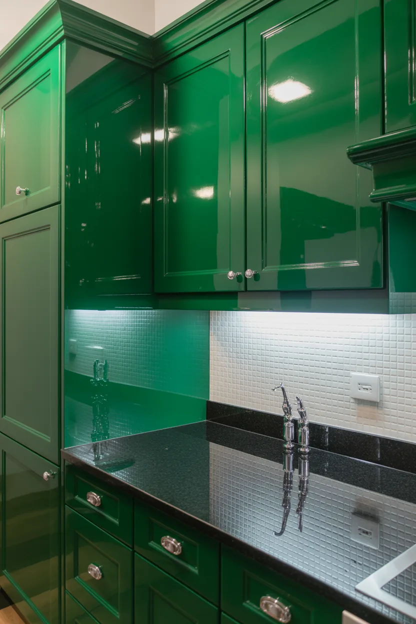
Okay. This one is for people who are fully committed to making a statement and have zero interest in playing it safe. Racing green with a high-gloss finish is a bold choice, and I mean that as the highest possible compliment.
It’s sleek, it’s moody, it’s the kind of kitchen that makes guests walk in, stop talking mid-sentence, and just look. It looks like someone made a very deliberate decision and followed through on it completely. There’s no wishy-washy about a glossy racing green kitchen. It knows exactly what it is.
This look works particularly well in smaller kitchens where you’re leaning into the cozy, jewel-box aesthetic rather than fighting it. Small kitchens often try to compensate with light colors to create the illusion of space, and sometimes that just results in a kitchen that feels cold and a bit clinical. Racing green does the opposite. It says: yes, this room is small, and it is absolutely gorgeous.
Pair it with chrome or polished nickel hardware rather than brass. The cooler tones suit the sharp, refined quality of racing green far better than warm gold tones do. Brass can sometimes make high-gloss dark greens feel a little too heavy. Chrome keeps it crisp and current.
10. Sage Green Shaker Cabinets — Timeless for a Reason
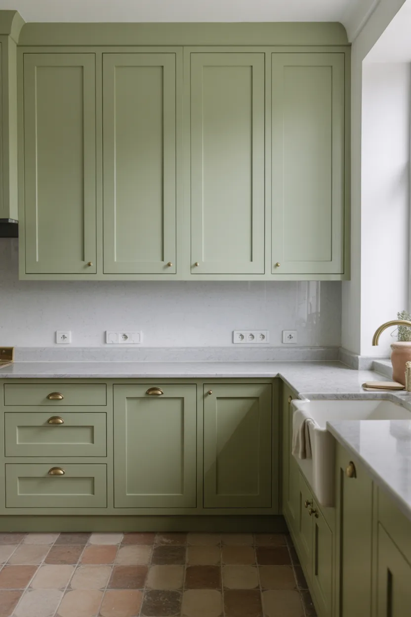
Shaker-style cabinets have been around for a very long time, and they show no signs of going anywhere. They’ll probably outlast every trend currently being discussed on every interior design platform, including several of the ideas in this article. There’s something about that simple, clean frame-and-panel construction that just works in almost any style of home.
In sage green, shaker cabinets hit that ideal sweet spot between classic and current. They feel right in a modern farmhouse kitchen. They feel equally right in a traditional period home. They even work in more contemporary spaces if you pair them with clean-lined hardware and keep the rest of the kitchen simple.
Also Read: 24 Bedroom Lamps Ideas 2026 That Feel Soft and Stylish
Shaker cabinets in sage green are compatible with almost any countertop material you can think of: quartz, granite, marble, butcher block, laminate if you’re on a budget. That material flexibility is a significant part of why this combination is so popular. You can start with painted shaker cabinets and change the countertop later as your budget allows. The green stays relevant throughout.
If you’re renovating a kitchen and you genuinely don’t know where to start, start here. Sage green shaker cabinets are the one recommendation I make to almost everyone who asks me about green kitchens, because the risk of getting it wrong is genuinely low.
11. Mint Green for a Retro Kitchen Vibe
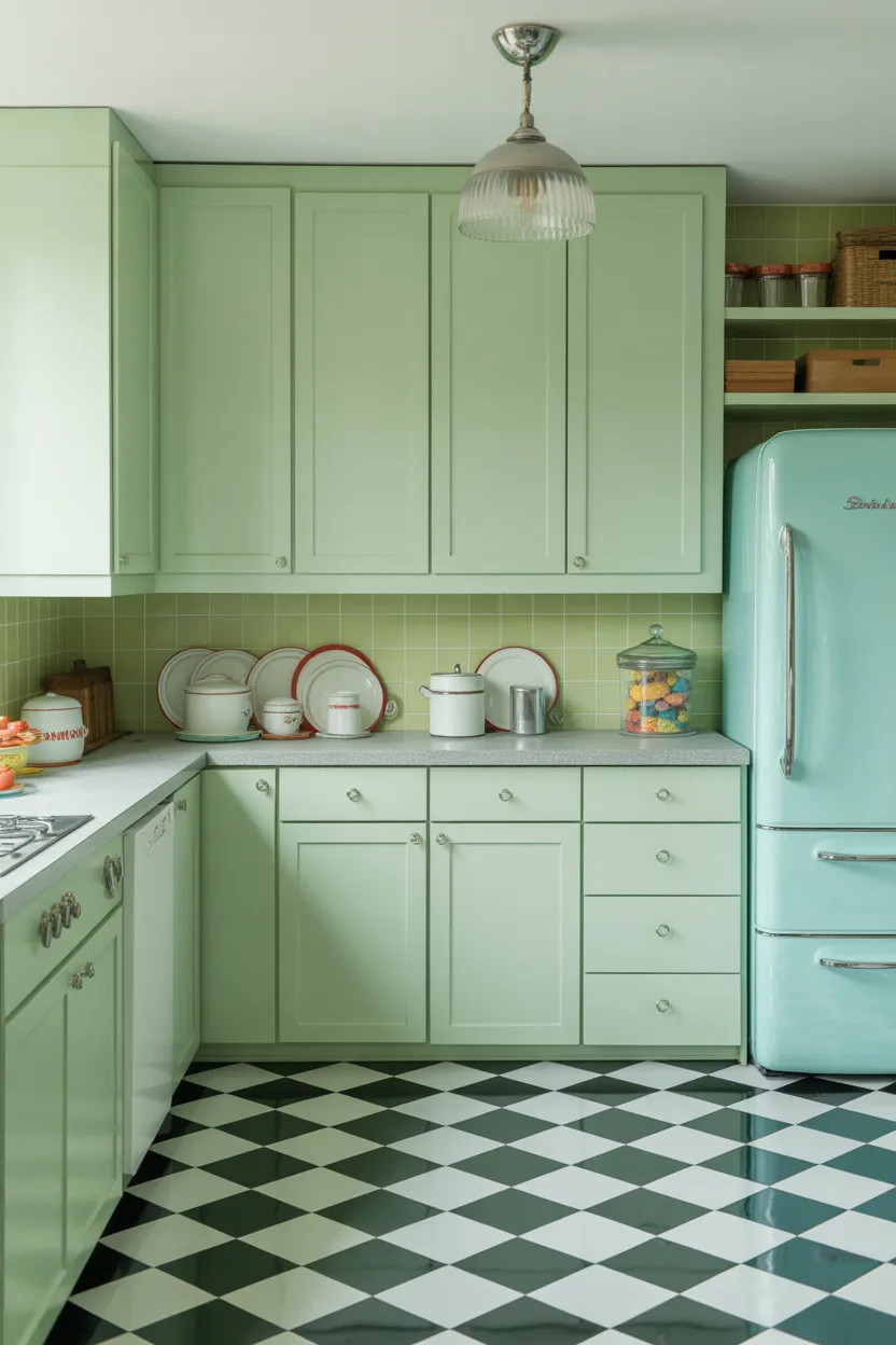
Mint green takes you somewhere specific the moment you see it. It’s the color of old American diners, of vintage Frigidaire refrigerators, of Sunday mornings in a kitchen that smells like coffee and something sweet baking. If that sounds appealing to you, mint green might be exactly what your kitchen needs.
When done properly, mint creates a cheerful, nostalgic atmosphere that feels fun without being childish. The key distinction matters here because mint green done wrong can look a bit like you decorated a kitchen for a birthday party. Done right, it looks like a thoughtfully curated retro space that people actually want to spend time in.
The trick is to lean into the retro references rather than mixing them with too many modern elements. Checkerboard floors in black and white. Chrome or polished nickel fixtures. Open shelving with vintage-style pottery and enamelware. These details support the mint green and make the whole thing feel intentional rather than accidental.
You can mix in one or two modern appliances because nobody wants to actually live without a modern dishwasher or a proper oven, but keep them clean and simple in finish. Stainless steel works here because it reads as neutral against the mint. Glossy black works too. Just avoid anything too aggressively contemporary in shape because it will break the visual story you’re building.
12. Dark Green with Black Hardware
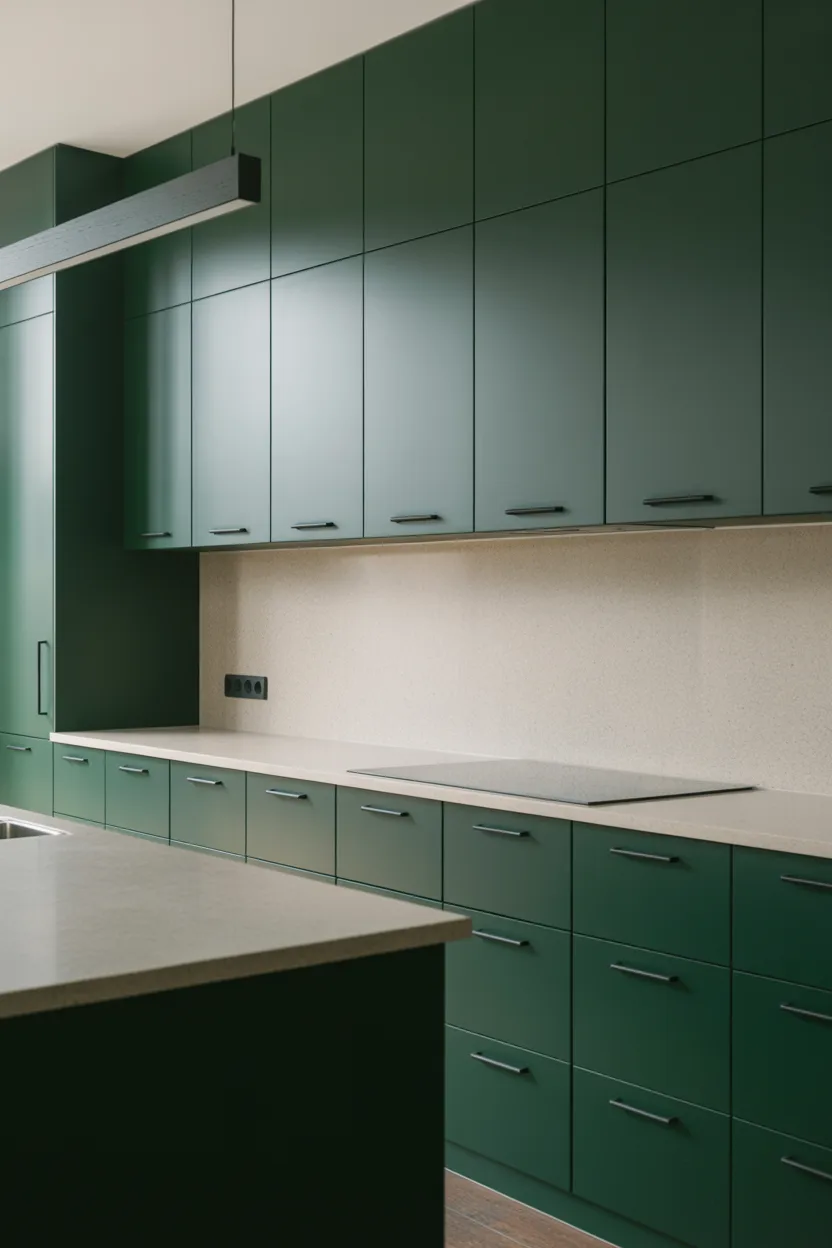
This combination is one of the most consistently good-looking things you can do in a kitchen right now, and it’s been quietly reliable for a few years while other trends came and went. Deep green cabinets, anything from hunter to forest to bottle green, paired with matte black hardware creates a look that’s contemporary, slightly moody, and works in photographs like almost nothing else.
The matte black pulls and knobs against deep green cabinetry create a level of contrast that’s sharp without being harsh. It reads as designed. It reads as intentional. And because both elements are fairly timeless in their own right, the combination doesn’t carry the risk of looking dated in five years that some trendier pairings do.
FYI, this combination needs good lighting to work at its best. Dark green cabinetry can absorb a lot of light if your kitchen doesn’t have adequate illumination, and the result can feel oppressive rather than moody and stylish. Make sure you have solid overhead lighting and ideally some under-cabinet strip lighting to keep the countertops bright. That contrast between the dark cabinetry and the well-lit work surfaces is what makes the look land properly.
If you’re working with a kitchen that doesn’t get much natural light, consider keeping the upper cabinets slightly lighter, a sage or a muted olive rather than a deep forest, and saving the darkest green for the lower cabinets and the island. You get the drama where it matters and you keep enough lightness in the upper half of the room.
13. Green Paint, No New Cabinets
Let’s be honest about something: new kitchen cabinets cost a genuinely alarming amount of money. Full cabinet replacement can cost tens of thousands of dollars depending on your kitchen size, the material you choose, and the cost of installation. For a lot of people, that number simply isn’t realistic.
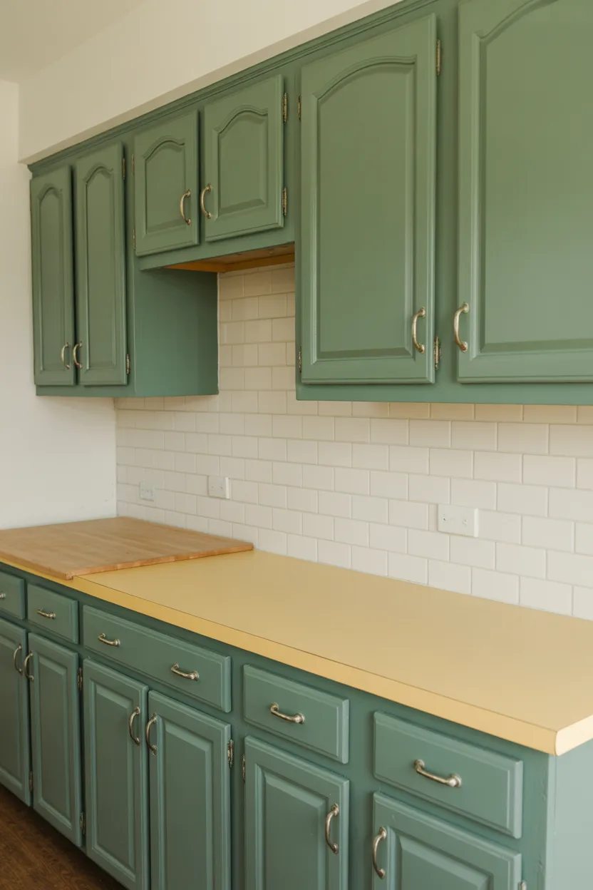
Here’s the good news: you don’t need new cabinets to get a green kitchen. If your cabinet boxes are structurally sound, if the doors aren’t warped and the hinges still work, you can paint them. And the result, when done well, looks indistinguishable from new.
A good primer, quality cabinet-specific paint in your chosen green, and new hardware is genuinely all it takes to transform the space. The process takes a weekend or two if you do it yourself, or a few days if you hire a professional painter. Either way, the cost difference is significant. You might spend a few hundred dollars in materials for a DIY job or a couple of thousand for a professional finish. Compare that to the cost of full cabinet replacement and the math is not even close.
The one thing I’d say is worth spending money on here is the paint itself. Don’t buy cheap paint for cabinets. It chips, it scratches, it shows every fingerprint within a week. A proper cabinet paint, properly applied with good preparation, will last years and look great the whole time. It’s the one area where the quality of the material genuinely shows up in the result.
14. Green and Gold — A Luxurious Pairing
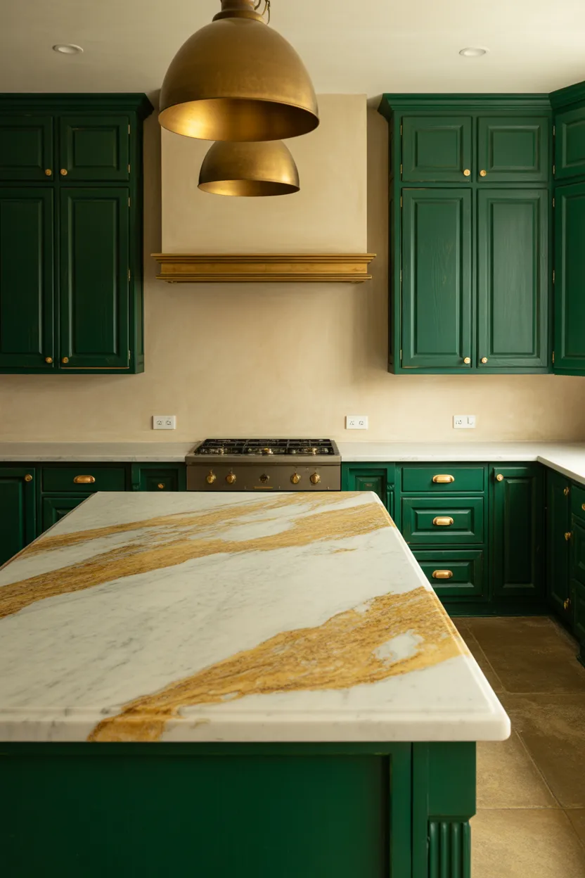
Green and gold together do something very specific to a kitchen. They make it look expensive in a way that’s hard to pin down but very easy to feel when you’re standing in the room. Deep green cabinets with brass or gold hardware, a marble or marble-effect countertop, and a gold or aged brass light fixture over the island, that’s a combination that makes people stop and ask who designed your kitchen.
The chemistry between green and gold works because green is cool and grounded while gold is warm and luminous. They balance each other without canceling each other out. Green keeps the gold from feeling garish. Gold keeps the green from feeling too serious.
Also Read: 23 Kitchen Remodel Concepts 2026 That Look Fresh and Beautiful
The shade of green matters a lot here. Jewel-toned greens like emerald and bottle green carry the luxury quality best because they have depth and richness that pairs naturally with gold’s warmth. Lighter greens like sage or mint can work too but they give a softer, more understated result. It’s still beautiful, just less dramatic. Think of it as the difference between a formal dinner party and a really lovely Sunday lunch. Both are good. Which one suits you depends on what you’re going for.
For hardware specifically, choose unlacquered brass if you can find it. It develops a patina over time that looks genuinely beautiful and gives the kitchen a quality that polished or lacquered brass can’t quite match.
15. Green Cabinets with Patterned Tile Floor
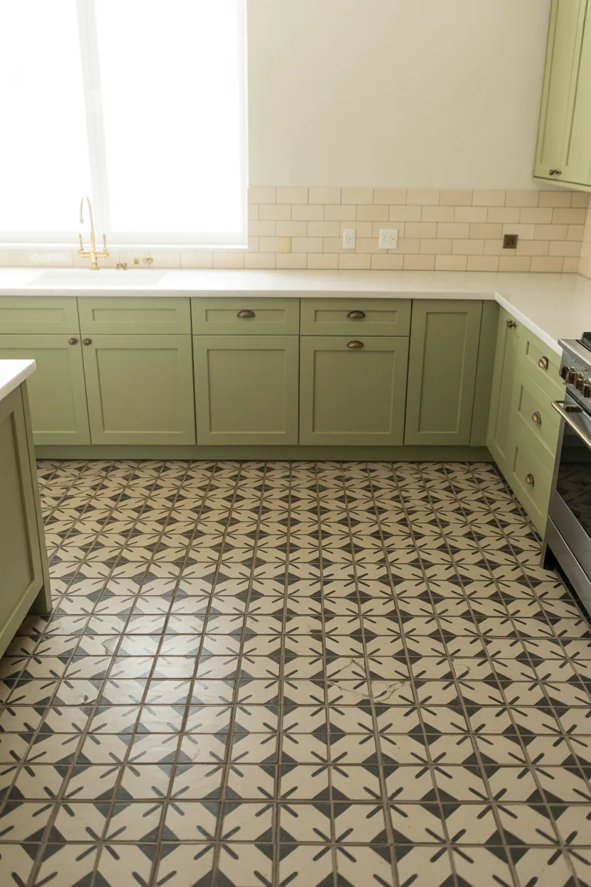
Want to know one of the quickest ways to make a kitchen feel like a proper room rather than just a functional space? Add a patterned tile floor. And if you pair that patterned floor with green cabinetry, you’ve got something that looks seriously designed.
Encaustic tiles in black and white are a classic choice that works with almost any shade of green. Geometric patterns in terracotta and cream look incredibly good against sage or olive cabinets. Moroccan-style patterns in blue and white work well with deeper greens. There are a lot of directions you can go here and most of them are good.
The important rule is one bold element at a time. A patterned floor and green cabinets are already two strong things in the same room. Keep the walls neutral, the countertops simple and plain, the hardware unfussy. Let the floor and the cabinets share the spotlight. Don’t add a patterned backsplash on top of this combination. You’ll tip over from curated into chaotic.
If you’re worried the floor will overwhelm a small kitchen, choose a smaller-scale pattern. A fine checkerboard in black and off-white works beautifully in a tight space and creates the illusion of more floor area rather than less.
16. Fern Green Pantry Door
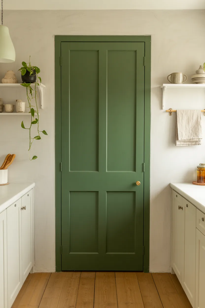
Not ready to repaint every cabinet in your kitchen? Not convinced you want to spend a full weekend with a paintbrush? Here’s the lowest-commitment entry point into the green kitchen world: paint one door.
A fern or forest green pantry door against white or cream walls is a small change with an impact that’s disproportionate to the effort involved. It creates an immediate focal point. It makes the kitchen feel thought-about. And it costs you a few hours and a small tin of paint.
This is also, genuinely, a great way to test how you feel about living with green before you commit to the full kitchen treatment. Some people think they want a fully green kitchen and then realize one green door is actually all they need. Other people paint the pantry door, love it, and immediately start planning how to do the rest of the kitchen. Either outcome is fine. The point is you get information without making a major financial commitment.
What color green works best for a single door? Fern, forest, and hunter green all work because they have enough depth to make an impact even on a single door. Lighter shades like sage or mint can get a bit lost if they’re only on one element in an otherwise neutral kitchen.
17. Green Island with Waterfall Countertop
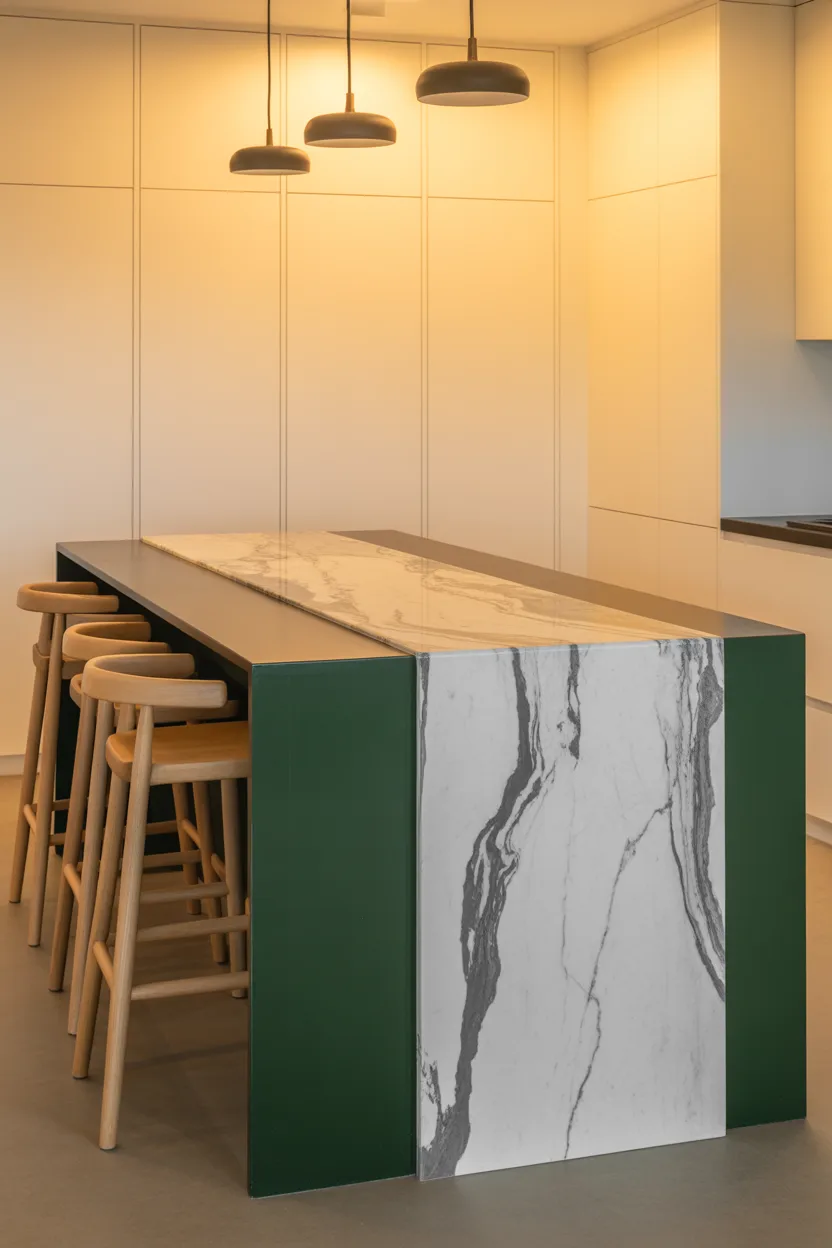
A waterfall countertop, where the stone or quartz continues straight down the side of the island to the floor rather than stopping at cabinet height, is one of those design details that costs more but earns every penny. It makes an island look like a piece of furniture rather than a built-in unit. It has a sculptural quality that most kitchen elements simply don’t achieve.
Put that waterfall countertop on a deep green island and you have something genuinely stunning. The combination of the strong green color and the clean architectural line of the waterfall edge creates an island that reads as the centrepiece of the room, which in most kitchens it really should be.
Also Read: 23 Vintage Kitchen Ideas 2026 That Feel Charming and Warm
White or light marble with subtle grey veining works particularly well for the waterfall element against a deep green island. The contrast between the crisp pale stone and the rich dark green is strong without being harsh. The veining in the marble adds movement and organic quality that keeps the combination from feeling too rigid or formal.
If solid marble is outside the budget, good quality quartz in a marble effect is completely respectable here. Nobody is going to crouch down and test your island with vinegar at a dinner party. Choose what works for your budget and install it well.
18. Sage Green with Warm Wood Accents
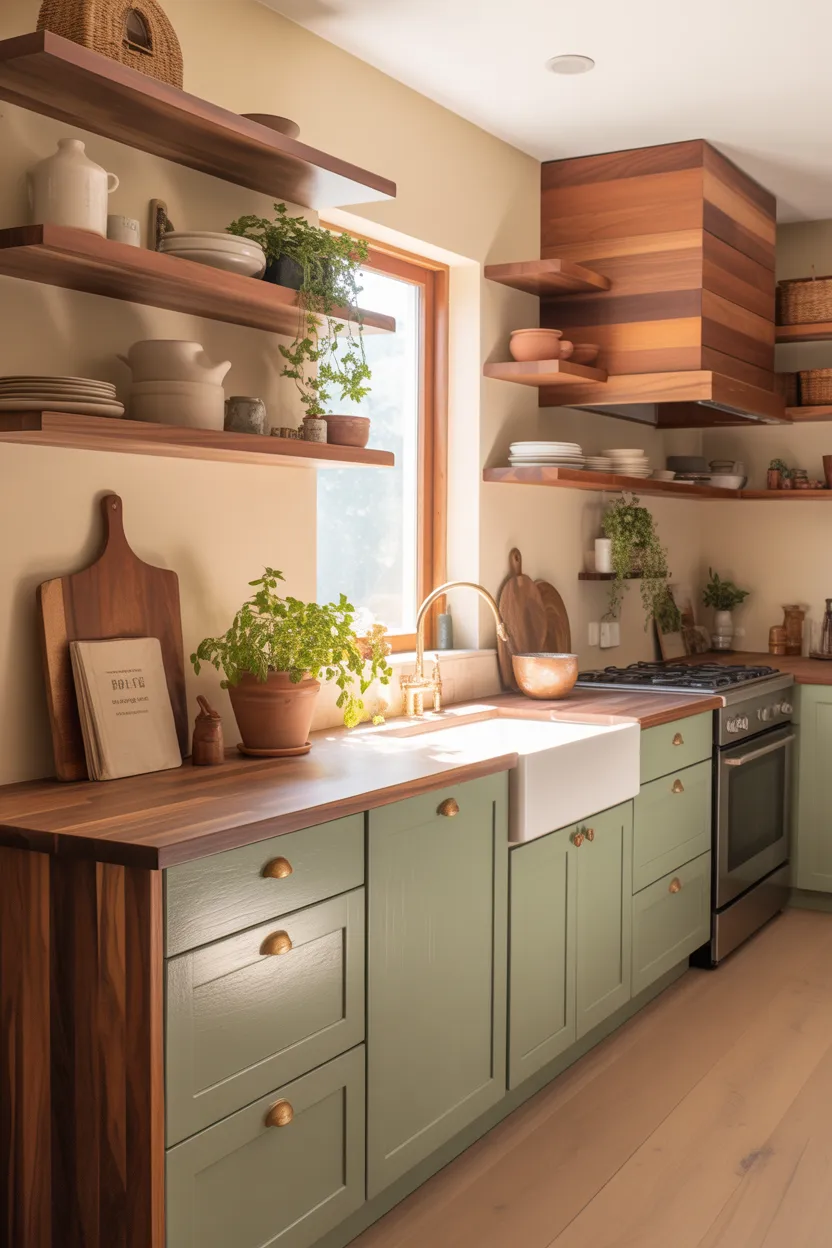
This is the combination that has been everywhere for the past couple of years and continues to show up on every interior design feed because people keep discovering it and falling in love with it all over again. And honestly, the popularity is deserved.
Sage green cabinets with warm wood accents hit something that’s hard to manufacture: they feel genuinely calm. Not sterile-and-cold calm, not show-home calm, but the kind of calm that makes you want to spend time in the room. The softness of the sage pairs with the warmth of the wood in a way that feels grounded and natural.
The wood accents can take a lot of forms. Open shelving in walnut or oak sitting above sage green lower cabinets. A wood range hood over a sage green range. A wood countertop section on part of the island. Even a wood breakfast bar attached to the island. Any of these work. All of them add warmth in exactly the right amounts.
The one thing to pay attention to is the undertone of your sage green relative to the wood you’re using. Sage greens with slightly yellow or olive undertones pair better with warmer, redder woods like walnut or cherry. Cooler sage greens with grey undertones pair better with lighter, more neutral woods like oak or ash. Getting that undertone relationship right is what makes the combination feel effortless rather than slightly off.
19. Green Ceiling, White Cabinets
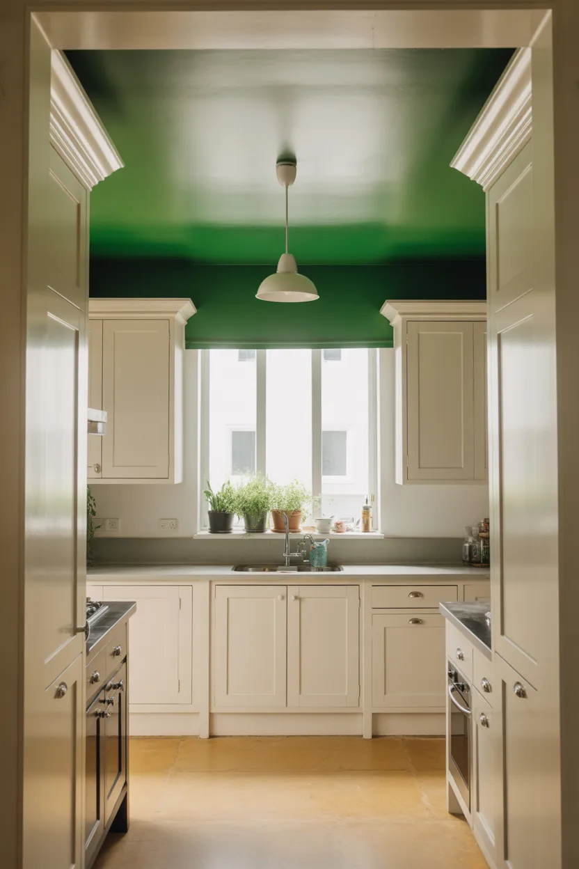
Most people paint their kitchen ceiling white or off-white without a second thought because that’s what ceilings are, apparently. But the ceiling is actually an enormous surface in any room and in a kitchen with standard height ceilings, it’s very much visible. Using it properly can completely change how the room feels.
Painting your kitchen ceiling deep green while keeping the cabinets and walls white creates a cozy, enveloping atmosphere that feels like being in a very chic garden room. The green comes down around you rather than towering over you, and it adds warmth and color to the space without touching a single cabinet.
Hunter green on the ceiling with clean white cabinetry below is a particularly strong version of this idea. It looks unconventional in a flat photograph and absolutely wonderful in person, which is maybe the best possible combination of qualities a design choice can have. People walk into kitchens with green ceilings and they feel the effect before they can articulate what’s different.
This works especially well in kitchens with slightly higher ceilings where there’s enough distance between the green ceiling and the eye level for the color to breathe. In a very low-ceilinged kitchen, it can feel a bit pressing. In anything above standard height, it’s genuinely beautiful.
20. Green Microcement Walls
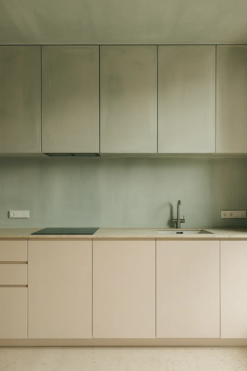
Microcement is a seamless, poured wall and floor finish that’s been common in European and particularly Scandinavian kitchens for years. It creates a surface without grout lines, without tile edges, without any of the interruptions that come with more traditional wall finishes. The result has a quiet, textured quality that photographs beautifully and feels very considered in person.
In green, specifically in the muted, slightly dusty green shades that work best with this material, microcement creates a backdrop for the kitchen that feels genuinely different from paint or tiles. It has depth and texture without being visually loud. It recedes and supports the rest of the kitchen design rather than competing with it.
Also Read: 24 Kitchen Pantry Foods Ideas 2026 That Keep Things Organized
Microcement is expensive and requires a specialist to apply properly. This is not a DIY weekend project. But it is incredibly durable, easy to clean, and the seamless finish means you will never scrub green-stained grout again in your life. For anyone who has spent real time cleaning tile grout in a kitchen, that particular selling point deserves a serious moment of consideration.
If the full treatment is out of reach financially, you can get a similar effect with textured limewash paint in a muted green. It won’t be identical but it captures some of the same quality at a fraction of the cost and it’s something most people can apply themselves over a long weekend.
21. Mixed Green Tones Throughout the Kitchen
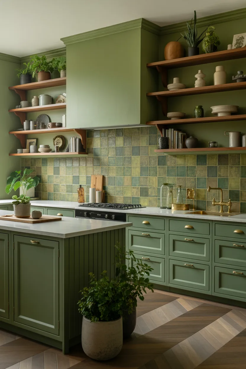
This is the most committed approach on this list and also, when it works, the most spectacular. The idea is to use multiple shades and applications of green throughout the entire kitchen: dark green island, sage green upper cabinets, a green tile backsplash, green-glazed pottery on the open shelves, maybe a trailing plant or two in the window. Let green be the undeniable, unapologetic theme of the room.
Done well, this looks rich and layered and completely intentional. Done badly, it looks like the paint section of a hardware store exploded. The difference between those two outcomes comes down to one rule: choose greens that share the same undertone.
All warm greens together, greens with yellow and olive in them, create a cohesive family. All cool greens together, greens with blue and grey in them, create a different but equally cohesive family. Mixing a warm olive green with a cool, blue-tinted forest green in the same kitchen is where things start to feel chaotic rather than curated.
Vary the depth and the finish freely. Dark green island, medium sage cabinets, lighter mint-tinged backsplash tiles, all completely fine together as long as the undertone stays consistent. Get that one thing right and you can layer as many shades as you like.
So Which Green Kitchen Is Right for You?
That depends on your space, your budget, and honestly, what kind of person you are in a room. If you love calm and timeless, sage green shaker cabinets are where you should start. If you want drama and you’re not afraid of it, racing green or bottle green with high-contrast hardware is your direction. If you’re genuinely not ready to commit to a full transformation, start with one door, one backsplash, or one painted island and see how you feel.
Green is one of those colors that tends to be addictive. Most people who try a little bit of it in their kitchen end up wanting more. That’s not a bad thing. That’s just what happens when you finally pick a color that actually does something for the room instead of just occupying space on the wall.
Your kitchen should feel like somewhere you want to be, not just a functional room you pass through. Pick a shade of green that speaks to you, start somewhere manageable, and trust that the room will thank you for it.
And your morning coffee? It’s already going to taste better in there. That part I can basically guarantee. 🙂